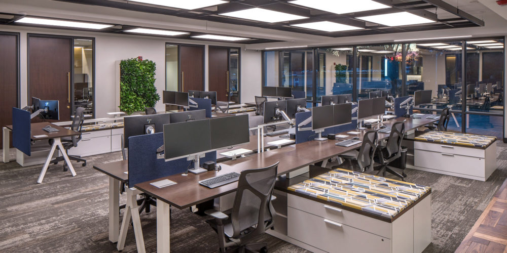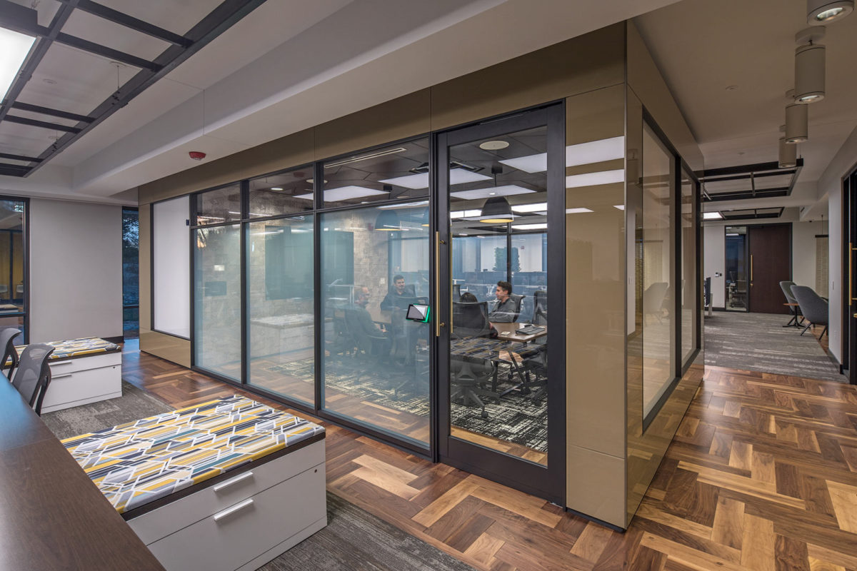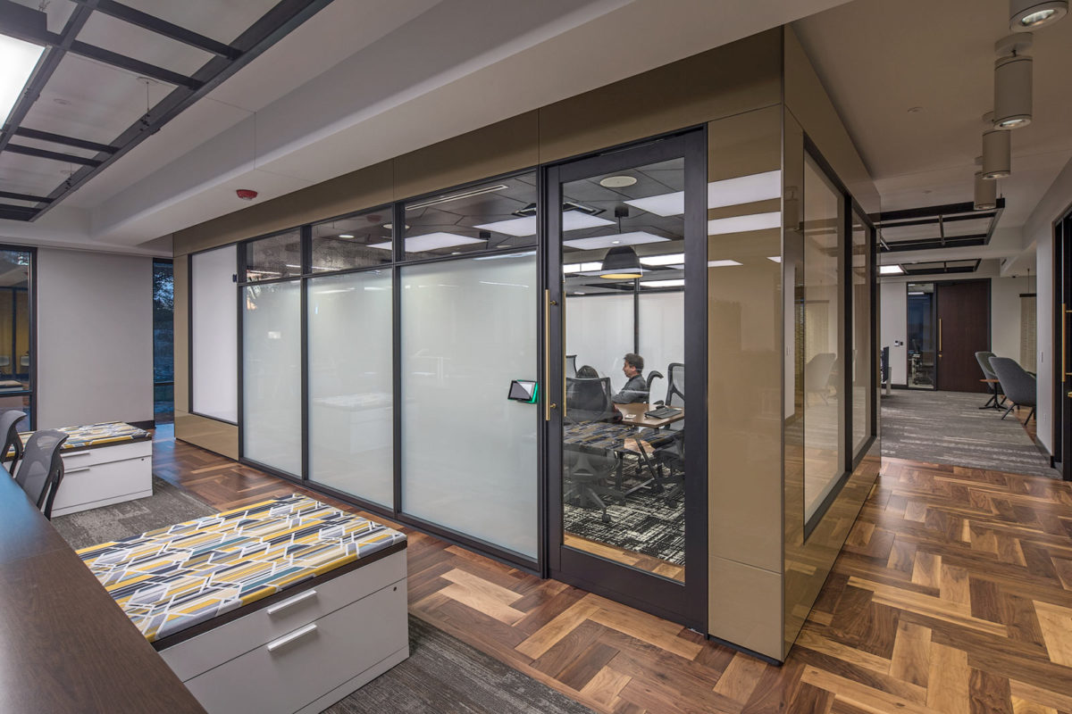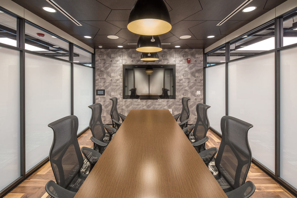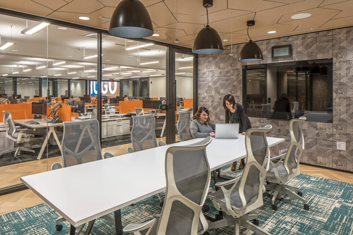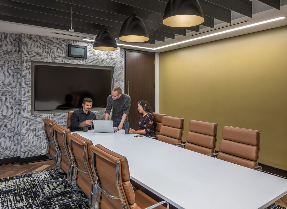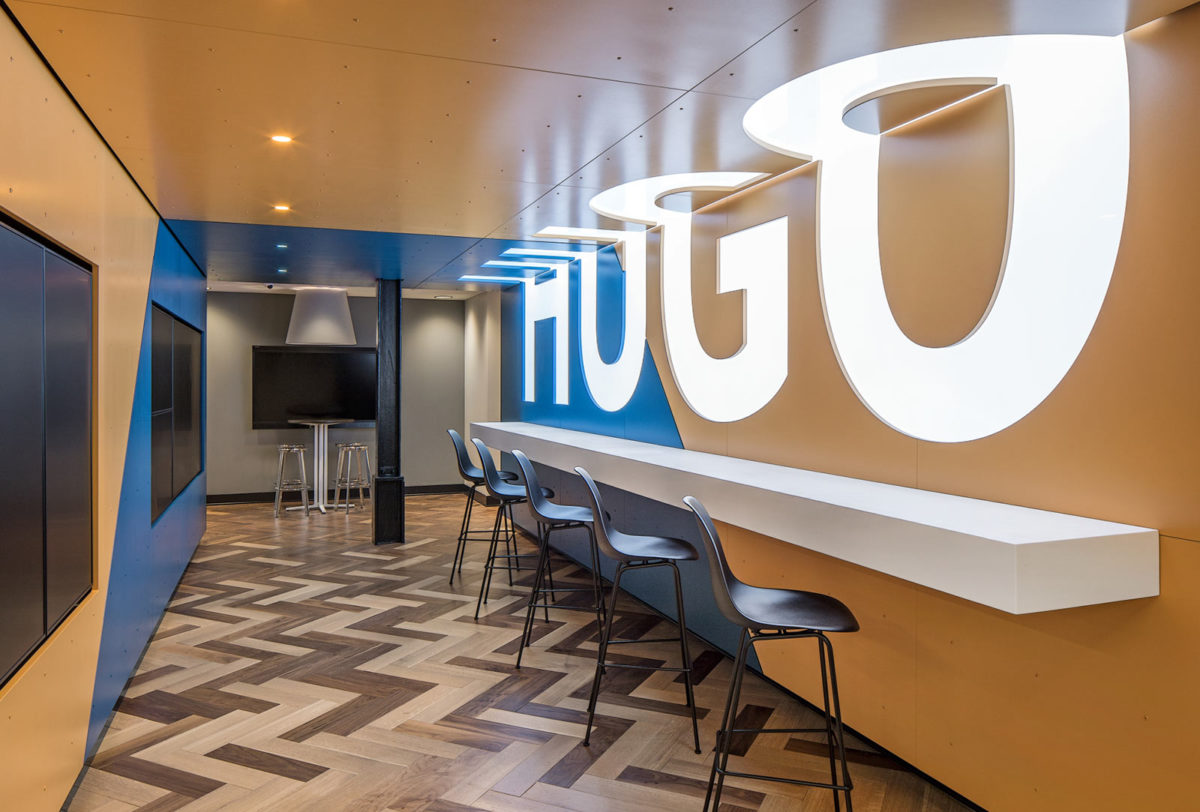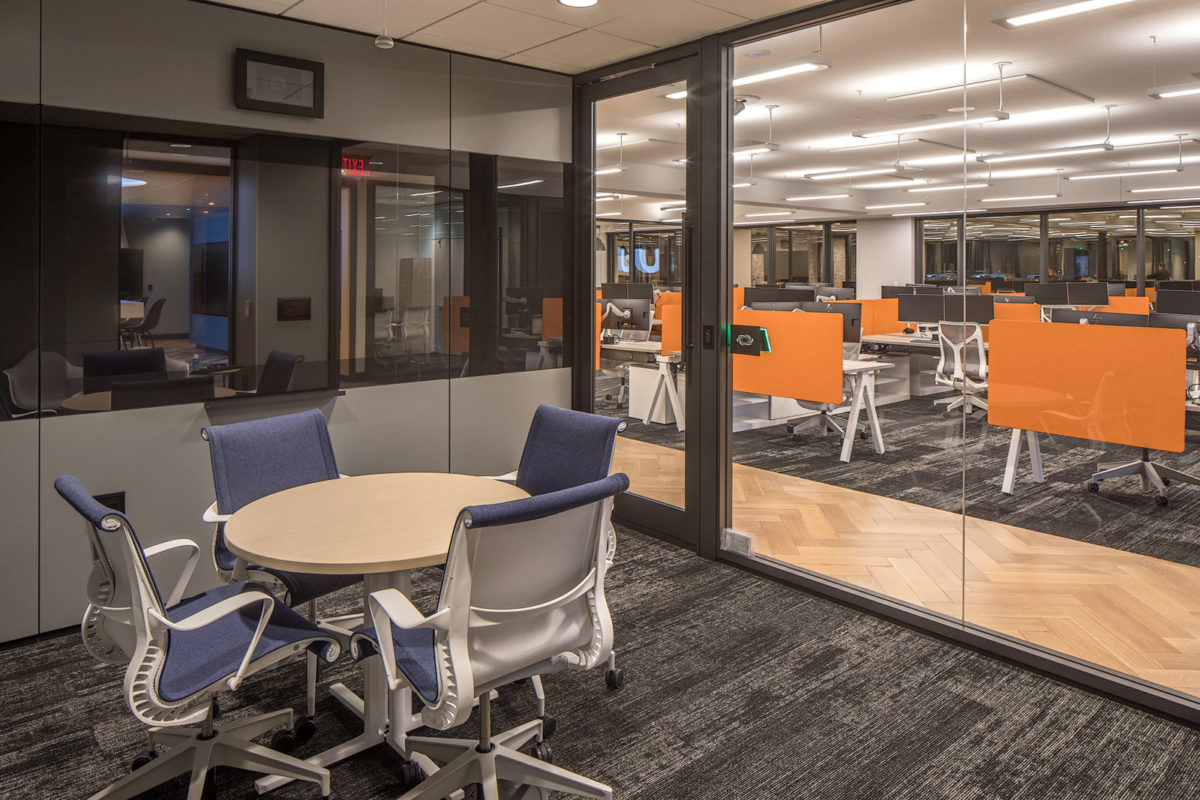
The challenge for this corporate office tenant improvement was two separate spaces, designed consecutively, for the same client. A rapidly growing company, the client acquired and doubled the square footage of Phase 1, already under construction. The solution became a careful mix of traditional and modern, a balance of dark and light, and deliberate use of complementary colors.
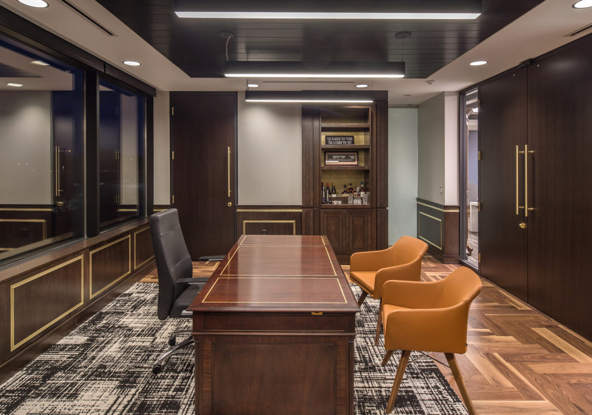
The project began with Phase 1, a modern high-end office suite with a unique take on traditional elements, such as brass, wood wainscot, and herringbone wood flooring playfully mixed with modern elements such as back-painted glass, LED ceiling grids, and graphic patterns. Once Phase 2 became part of the project, it was clear that the second space needed to feel like it was part of the whole project, but also remain distinctly unique.
A play on opposites brought the project together. Phase 1 used rich wood tones and traditional construction methods, whereas Phase 2 incorporated light wood tones and prefabricated construction. The same finishes used throughout were made distinct in contrasting colors to transition from one side to the next. The contrasting finishes blended in a connector space, known as “The Portal,” transitioning one side of the office to the next.

Additional Views
Project Summary
Services Provided
- Master Planning
- Architectural
- Interior Design
- FF&E Coordination
- Construction Documents
- Construction Administration
Characteristics
- 13,000 s.f.
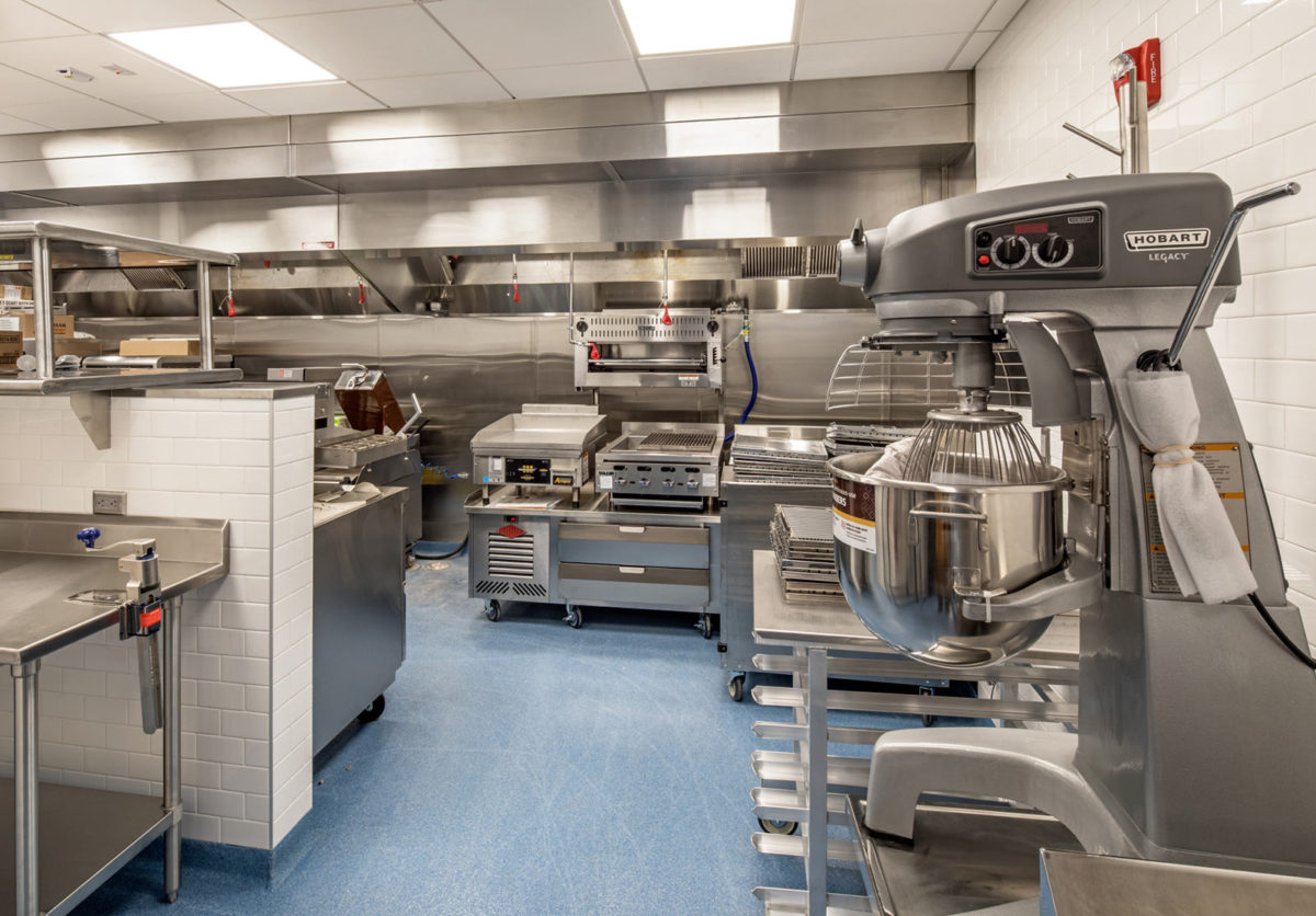
- New headquarters that includes a commercial test kitchen to support catering efforts within the office, as well as a “tasting laboratory” for the company’s growing restaurant concepts
- Seamless and sophisticated design of blending old-world executive-style private offices with modern common workspaces featuring DIRTT partition walls and millwork solutions
- Multiple break-out and huddle spaces, private booths for calls, AV display wall to display real-time content of all company initiatives


